THE PROJECT
Walgreens.com served 100M+ Balance Rewards members but lacked digital coupon capability—a significant competitive gap as consumer behavior shifted toward mobile-first shopping. I was part of the team that launched Walgreens' first e-commerce coupon hub from the ground up.
Working from UX wireframes and product requirements, I designed the visual interface and established design patterns for this new capability across responsive web and mobile experiences.
Role: Senior Visual Designer
Team: Cross-functional (UX Research, Product, Engineering, Marketing)
Tools: Photoshop, Illustrator, InDesign
Employer: Walgreens
Team: Cross-functional (UX Research, Product, Engineering, Marketing)
Tools: Photoshop, Illustrator, InDesign
Employer: Walgreens
THE CHALLENGE
Building something entirely new meant:
• No existing user expectations or mental models to build on
• 70%+ mobile traffic in an era when mobile-first design wasn't standard practice
• Scale requirements from day one (100M+ members)
• Integration with legacy systems and existing Balance Rewards experience
• Creating trust in a digital coupon system users didn't know existed
• 70%+ mobile traffic in an era when mobile-first design wasn't standard practice
• Scale requirements from day one (100M+ members)
• Integration with legacy systems and existing Balance Rewards experience
• Creating trust in a digital coupon system users didn't know existed
KEY DESIGN DECISIONS
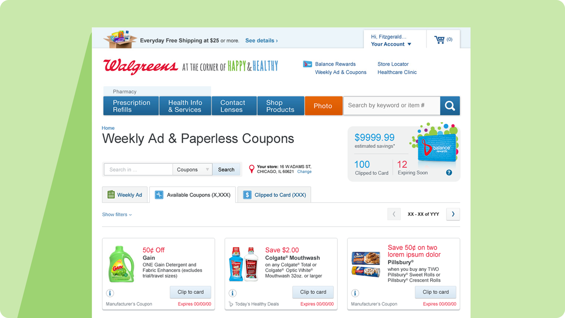
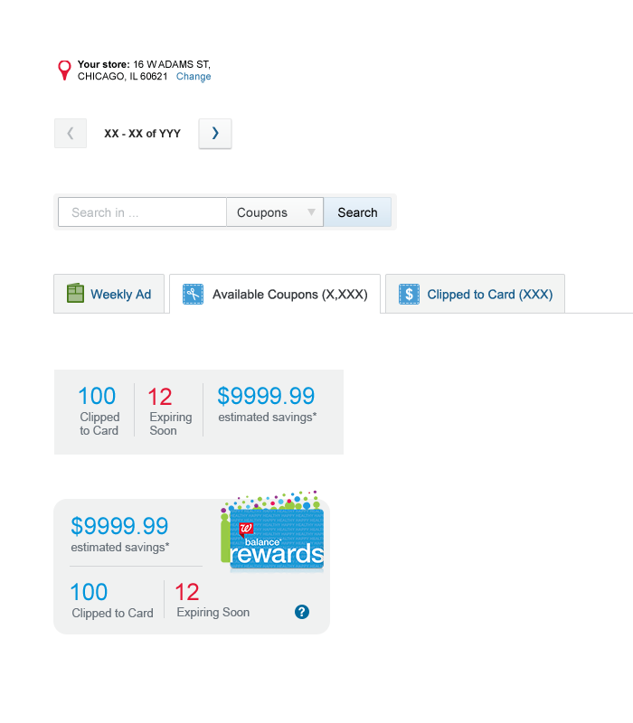
1. Card-Based Layout for Clarity
For a brand-new feature, users needed clear visual signals about what coupons were and how to act on them. I designed a card-based system where each coupon was a distinct, scannable unit with:
• Product image as visual anchor
• Prominent savings amount
• Single-tap clip action
• Clear expiration and category
• Prominent savings amount
• Single-tap clip action
• Clear expiration and category
Why it worked: Cards provided visual containment and flexibility to accommodate varying content while maintaining mobile-friendly layouts that naturally reflowed across screen sizes.
2. Mobile-First Visual Hierarchy
With mobile representing the majority of traffic, I designed for small screens first—unusual for 2014. This meant:
• Large touch targets (44x44px minimum)
• Single-column layouts to reduce cognitive load
• High contrast for outdoor readability
• Sticky navigation for persistent access
• Progressive disclosure for advanced filters
• Single-column layouts to reduce cognitive load
• High contrast for outdoor readability
• Sticky navigation for persistent access
• Progressive disclosure for advanced filters
Desktop designs adapted upward with multi-column grids and persistent sidebars, but mobile experience drove all decisions.
3. Clear Visual States & Feedback
Since this was Walgreens' first digital coupon system, users needed confidence their actions worked. I designed distinct visual states:
• Available: Clear clip button, full color
• Clipped: Checkmark, color shift, undo option
• Expired: Reduced opacity, still visible for context
• Featured: Subtle highlighting for promotional content
• Clipped: Checkmark, color shift, undo option
• Expired: Reduced opacity, still visible for context
• Featured: Subtle highlighting for promotional content
Immediate visual feedback was critical—especially on mobile where network latency could delay confirmation.
4. Category-Based Navigation
UX research showed users came with shopping intent ("I need pharmacy items"), not random browsing. I created:
• Prominent category filters with custom icons
• Multi-select capability
• Count indicators per category
• Persistent access without losing scroll position
• Multi-select capability
• Count indicators per category
• Persistent access without losing scroll position
This aligned the interface with users' mental model of shopping by need.


DESIGN SYSTEM
Since this was a new capability, I established reusable patterns:
• Responsive component library (cards, filters, navigation)
• Visual state system for all interactive elements
• Typography and color hierarchy
• Icon set for categories and actions
• Documentation for engineering implementation
• Visual state system for all interactive elements
• Typography and color hierarchy
• Icon set for categories and actions
• Documentation for engineering implementation
These patterns became foundational to Walgreens' digital ecosystem and the patterns are still in use today.
OUTCOMES
• 135 million coupons clipped in first two years
• Established competitive parity with CVS and Target
• Strengthened Balance Rewards value proposition
• Created design system foundation for future digital products
• Proved mobile-first approach could work at enterprise scale
• Established competitive parity with CVS and Target
• Strengthened Balance Rewards value proposition
• Created design system foundation for future digital products
• Proved mobile-first approach could work at enterprise scale

REFLECTION
This project taught me to design for scale, work within enterprise constraints, and establish trust when launching entirely new capabilities. The mobile-first approach was ahead of its time in 2014 and validated the value of designing for constraints first.
Looking back, I'd prioritize more rigorous accessibility testing and personalization features—but the core patterns (cards, clear states, category navigation) remain sound approaches for discovery-based interfaces.